Showing posts with label COLOR ANALYSIS. Show all posts

Tuesday, May 28, 2013

What are the Colors for each Season?

How to find which colors to wear through the Seasonal Color Theory

Part 6 of the #2 Key The 5 Keys to Dressing Well

The wrong colors can make you look older, heavier, tired and even ill. I think it is just as important to know which colors we should avoid, as which colors we should wear! Seriously! If we learn which colors to avoid we are one big step ahead!

The wrong colors also often compete with you for attention, so that when people see you, they actually see your clothes before they see you.

For me the equation goes like this:

  • Know which colors you like - (just because! they make me you feel good = emotional/psychological meaning)
  • Know which colors compliment your skin, hair and eye color -  (usually you are already wearing some of these colors intuitively, but you can find this out through a color analysis).
  • Know which colors  to avoid, because they can really damage your overall look!. 
Your intuition + personal taste + color analysis = your colors

Where the emotional (your intuition) meets the scientific (professional color anaylisis) you have found your colors!

SEASONAL COLOR THEORY

So here let's look at the Seasonal Color Theory. Because there are so many different people in the world, and we are all unique, image consultants have figured out that in order to come up with an effective system to analyze color, we must look at Nature.

And through nature, the easiest, most obvious way to understand color, is through the seasons. All four seasons have unique and very distinct characteristics, and because of the position of the sun in relation to the earth, colors are seen and perceived differently during each season. Imaging the Sun being a huge, big lamp! and we are being illuminated by it all our lives. Each season is like if we were changing the location of the lamp at home. If we did that, things would look differently, and colors would look very different! So with that in mind. Imagine each season and how that light projects in Nature, and you have the Seasonal Colors.

 Let's take a look at the color characteristics of each season, and how it relates to individuals.

So we will start with the two seasons that have a Cool base. They are Winter, and Summer. Remember the quick test we did to find out if our skin's undertone is warm or cool? Well if you have a cool undertone, it means you are either a Winter or a Summer. And you will see some of the colors that will compliment your own personal coloring below.

WINTER


seasonal color analysis winter
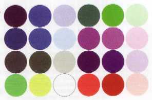
A winter colored individual has a lot of visual contrast (e.g. dark hair, light eyes, pale skin) therefore can wear very intense, bright, and deep colors. They wear well navy, black, charcoal and bright white as their neutrals.
Winter colors are cool, clear and dark to light intensity. Think of the winter landscape colors. In the low light of winter colors appear darker, but on a bright day with the sun reflecting off snow colors appear pale and icy. Winter is icy, colors are seen in their purest form.

SUMMER


seasonal color analysis summer
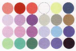
Summer colored individuals are like summer breeze, serene and calm. Colors are delicate, their contrast is minimum, their main characteristic is that they are soft, the opposite of Winter in intensity. But they share the same cool-undertone.
Summer colors are muted and medium-light to medium-dark in value. Think of seeing the landscape through the summer heat. These colors are muted, paler versions of Winter’s. The light colors are creamy pastel rather than icy.

Here you can see a chart that compares fabric swatches for both Seasons, you can see that the cool base is shared by both Winter and Summer. With the difference that the Winter colors are darker, brighter and more intense. The summer colors are muted, they have more white added, they are "washed" out and not so clear or bright. Winter and Summer have the same temperature (Cool), but they have different Value (lightness/darkness) and different Chroma (brightness/softness). If you are confused take a look at The Basics of Color.


Now let's start with the two Seasons that share a warmth undertone, they are Autumn and Spring.

AUTUMN
 seasonal color analysis autumn 


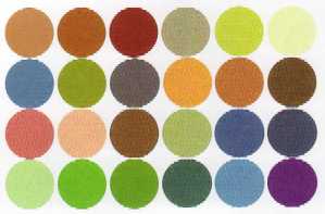
An autumn colored person has more green tones in their veins. They look great in neutral colors like beige, ecru, warm olive, rich golden browns. The earth tones are perfect and look gorgeous on Autumn individuals.
Autumn colors are warm,


medium-light to medium-dark intensity. Think of the leaves of trees during Autumn, colors of rich burnt oranges, reds, golden yellows and yellowish greens.


Now let's look at Spring!

SPRING


seasonal color analysis spring


Spring colored individuals have a warm undertone, and bright coloring, usually their eyes are a bright blue or green. They have medium to low contrast. 
Spring colors are also warm, but clear and bright with medium to light intensity. Think of the bright clear colors of spring flowers.

Both Spring and Autumn colors have a Warm undertone, Autumn colors are deeper, richer and have more yellow. Spring colores are brighter, lighter, and although have a warm undertone, they are clear and bright (just like Winter).


Monday, May 27, 2013

Is my Skin Warm or Cool?

Let's continue with part 5 of the Key #2 of The 5 Keys to Dressing Well

How do I know my skin's undertone?

This is the most important characteristic of color we should consider when choosing our personal colors.
Is my skin warm or cool? To understand more about color's  psychological and relative temperature take a look at The Basics of Colors to understand what makes colors seem warm or cool.

So, is your skin warm, cool or balanced?

One quick way to decide is to take a look at the inside skin of your forearm, and look at your veins there. Can you see them? Do they look blue, or purplish? or more like green?

  • Cool - bluish or purplish veins.
  • Warm - greenish veins
  • Balanced - somewhere in between, neither blue, nor green.

Why is this important? Because all colors have either a blue or a yellow component. Remember the three primary colors are Blue, Yellow and Red and from those, all other colors are created. Red being the "balanced" one when it comes to skin tone. Yes, I know it is hard to understand, because red is considered warm, but for our skin is considered a neutral.

If our skin has a warm undertone, we usually can wear well all colors with warm tones, therefore colors containing more yellow in their composition.


 If our skin has cool undertones, we can wear well all colors that have a mostly blue base.


When it comes to choosing the colors for our wardrobe, what we need to strive for is harmony, remember I talked about color Harmonies? Well, the same thing happens when we put ourselves in the equation. Go back to this post to remember about the basic color harmonies. 

We are the main component in the harmony we are to create with color, so it is important for us to determine, where am I in the color wheel?! I know it sounds strange! Hey! I am not the Incredible Hulk! neither am I Sesame's Street Yellow Bird....yes I know, but we DO have colors in us, and we need to find them...so that we can create the most beautiful harmonies possible! So in order to do that we start with our base....Are we closer to the blue? or closer to the yellow? or equally distant, as if we are red?

Having a Color Analysis done by an expert can be a valuable tool to help you improve your Personal Image.

This is another simple method you can use at home to determine for yourself whether your skin undertone is warm or cool.
  • Place a gold and a silver bracelet/watch across your forearm. If  you can see warmth in your skin using the gold and with the silver you can't, then you are probably warm.
  • Think about the type of jewellery you like to wear. Is it almost always gold? or you prefer silver? Gold is warm, Silver is cool. So if you like to use white gold, platinum, or silver accessories because they "suit" your skin and face better, then you most probably are Cool. If on the other hand all the jewellery you wear or accessories are mostly golden, then you are most probably Warm.

So when we have a professional Color Analysis done, what the we do, is first wear a grey or white robe, be in natural light or use a special lamp that imitates the sunlight we need, in case we are indoors and there are no windows, or the day is cloudy.


The we use two cards with different color swatches both blue and yellow based, to determine if the undertone is warm, cool or balanced. Once we have determined the skin's undertone we start the process of draping different colors to "see" which ones look good on you.

In general colors that are in harmony with your own personal coloring are those that:
  • bring out your best features.
  • make your eyes pop.
  • even out any imperfection you might have in your complexion.
  • they make you look rested and younger.
Colors that are not in harmony with your own personal coloring are those that:
  • make you look older
  • tired
  • cast shadows under your eyes, and chin
  • uneven your skin-tone
  • compete with you for visual attention.

Keep in mind that everybody can wear some "version" of almost every color, because all colors can have a blue or yellow base, or be neutral (universal colors).

I will tell you about the Seasonal Color Theory tomorrow. Stay tuned, because that is the system most widely used in the world to categorize personal coloring....

So tomorrow you will learn....Am I a Winter? A Summer? A Spring? or an Autumn?

Which one am I?! Is it "important" to know?

Stay tuned...


How does Color Analysis work?


How does Color Analysis work?
We have talked about The Basics of Color and The Meaning of Color in previous posts. Let's continue with the ways in which we can identify our own personal colors! This is part 4 of the # 2 The 5 Keys to Dressing Well.

So do we really need to have an "expert" tell us which are our best colors? Not really, I don't think so. When I was studying at the University to become an Image Consultant, I took a special class with a renowned Color Specialist on Color Analysis, I learned how to do it professionally, and while I was doing it, I had my own Color Analysis done. It cleared many questions I had with regards to the use of color, but again, in the end it is how we implement what we learn that counts. So, sometimes we have a big colored lens trough which we see ourselves, and that doesn't help in having an unbiased analysis! So it isn't necessary but it certainly helps a lot to be "seened" by someone else, who can give us an honest and professional answer. 

The process of doing a color analysis for someone focuses on three main characteristics of color: the undertones (hues), the depth (value) and the clarity (chroma) against a person's skin, eyes and hair.In that order, making the color against the skin the most important factor in determining which colors are flattering.

There are different systems used by color analysts to classify personal coloring:

The most used ones are The Seasonal System which classify people into (Winter, Summer, Spring and Autumn) and the other one classifying someone as (Light or Deep, Warm or Cool, Clear or Soft).
These two are the most widely used systems. I recommend the use of both, since they basically complement each other and give more useful information and more color choices as a result. As such we can describe our own personal coloring within these categories.

Our personal coloring changes with time, as we change. Color in our hair changes, we don't have the same hair color now than we did ten years ago, and we probably will not have the same color in ten years from now. The same happens with skin tone, but our skin tone changes seasonally as we increase and decrease sun exposure and tanning and whitening of the skin is its result. I will say that what remains more constant in our personal coloring is eye color, although we can see in very old people a lightening due to ageing of the eye. So which ever results we get now from our personal coloring analysis are valid as long as the hues (this don't change, unless we dye our hair a complete different color, and wear color contact lenses e.g.) the chroma and the value of our colors remain the same.

What I like to do for my clients is to give two groups of color options for their wardrobe, one to be used for the warm weather and one that can be used for cooler climates and grayer skies. I recommend most people to have this two palettes, especially if you like tanning, and get highlights in your hair during Summer.

Let's see to start with some personal coloring characteristics and main divisions, so that you can start familiarizing yourslef with, and see if you can identify with any of the following:


LIGHT - (you have a light value to your coloring, e.g. natural light color hair (blond, gray) light color eyes (pale blue, grey or light green) light eyelashes and almost no eyebrows. Your skin burns easily in the sun, and is delicate, porcelain like. Think Claudia Schiffer, Cate Blanchett, Naomi Watts.
Pic courtesy of: Eva Rinaldi

DEEP - Dark colored hair, dark eyes, dark eyebrows and lashes. Your skin an either be whitish porcelain skin all the way to very dark. Think Catherine Zeta Jones, Eva Longoria, Penelope Cruz, Frieda Pinto, Winona Ryder, Keira Knightley.

WARM - Red tones in your hair, from strawberry blond to auburn. Your skin is warm.Your eyelashes and eyebrows are reddsih. You can have freckles. Eyes can either be green, brown or blue. Think Julianne Moore, Christina Hendrix, Heather Graham, Jessica Chastain.


COOL -  Hair has ashy tones, either dark brown, blonde, white or grey.  Eyes are clear brown, green, grey or blue. Your skin is cool. You have a pinkish or blueish undertone. Think Meryl Streep, Judi Dench.

Pic courtesy of Caroline Bonarde Ucci

CLEAR - Dark hair. Bright striking eyes, usually green, blue or topaz. Dark eyebrows and eyelashes. Your look is very contrasting from light to dark. Your skin can be any tone, from light to dark.Think Courtney Cox, Liv Tyler, Megan Fox, Emily Blunt.

Pic courtesy of: Joella Marano


SOFT - Dark blonde or light brown hair. Eyes can be any color, but are a soft shade and can change color with the weather. Little contrast between hair, skin and eye color. You can identify certain characteristics of yourself in the other five dominant types. Think Kylie Minogue, Kate Hudson, Charlize Theron, Amanda Seyfried, Rachel MacAdams, Natalie Portman, Beyonce.
Pic courtesy of Tom Sorensen


It is possible you don't find yourself indentified with any of these main dominant types, and you don't think your coloring is similar to any of these actresses. I think it is a very good tool to look at pictures of all these women, so you can start picturing in your mind, the characteristics of each type.


Don't fret, this doesn't end here, it is a journey and we are on it together. So why don't you go and grab a coffee a few of your favorite pictures and see if you can identify any of these characteristics on yourself.

I will tell you all about the most important thing to pay attention when it comes to your personal coloring, in the next post...

Till tomorrow!


Saturday, May 25, 2013

Personal Coloring - The Basics of Color

Key # 2 - Part 3 - of The 5 Keys to Dressing Well


Personal Coloring - The Basics of Color


Our bodies have a unique color pattern, we need to choose colors that enhance it.

Let's talk about hues: hues are the common names we use to refer to colors, such as: blue, green, red, yellow, purple, etc.

There are six basic hue families: the reds, the oranges, the yellows, the greens, the blues,  and the violets or (purples).

When we talk about colors we use names that are very descriptive, we may refer to food or animals to name them, such as peach, salmon, canary yellow, apple green, etc. This is important because when we just talk about colors and can't show them visually, we need to have tools that can help us and everyone picture the color in their minds. At the end of this post there is a list of color names for your reference.
  
Color also has temperature - We can categorize hues are either warm or cool. 
Psychologically we give colors temperature: so the reds, yellows and oranges,  are usually regarded as warm, they remind us of fire, the sun, the power of aggression.
The blues, violets and greens, remind us of cold splashes of water, shadows under trees, mountain tops, deep blue skies, these colors are often associated with distance, calm, tranquility, and coolness. 
Thus hues can either be warm or cool. The warm hues are more yellow. Cool hues are like the sky and water they recede in the background.

Primary colors - red yellow and blue.
There are other terms you should be familiar with, they are:
Value: it describes how light or dark a color is.
Chroma: it refers to the purity of a color. How clear or muted a color is.
Harmony: the way we combine certain colors.

Now let's go back to the temperature of colors, beacuse here lies a lot of the relevance we will give to them when choosing our own palette.

We said that the reds, oranges, and yellow are warm, and the blues, violets and greens are cool. That is just to begin with. That is the psychological association we give to color. But colors also have a relative temperature that depends on how it is mixed, let's see, for example if you look at the color wheel the red, if it is mixed with blue, it becomes Red-Violet, and has a cooler temperature, the same thing happens, with yellow when mixed with green, Yellow-Green.
This especially happens with greens that although they are considered cool, they are a mixture of both yellow (warm) and blue (cool). All oranges are warm, because they are made up of red and yellow (both warm). I believe orange is one of the most difficult colors to wear well.   But sometimes we can change its value, and make it work! 

Value

Let's continue with the orange, it can either be very dark or very light. This relative darkness or lightness is called value. We can add white to an orange pigment and make it lighter, thus changing its value, but what we can never do with orange is change its temperature. If we do it will no longer be orange. Usually when colors are light they appear "tinted" or whitish. We can also add black to orange to make it darker. It will appear shaded, deepened, and weighty. Usually when colors are darkened by adding black they are considered: serious, profound, mysterious.
There are other ways to lighten and darken colors, and also to mix them, but I am not going to go further into this, for now. It is not necessary for our purpose, and I don't want to complicate things.

Chroma

This is very important when it comes to choosing our wardrobe also. Colors can be clear, which means the pigment is very pure, or muted which means the color was combined with its complementary color or shaded with gray to soften it down. Clear colors are bright and vibrant and tend to reflect light. Muted colors appear misty, veiled, and de-intensified. Muted colors are gentle, soft, and can be also subtle.

Harmony

Harmony is the combination of hues, and we use it in clothing to achieve a certain look and style. 
Harmonies can be:
  • Monochromatic: only one color, use one hue (e.g. all blues, light blue top and navy blue pants)  Same hue is with different values. 
  • Triadic: the harmony created by hues that are equidistant from each other on the wheel (e.g. red/yellow/blue or green/orange/violet)
  • Analogous: two or three hues that appear side by side on the color wheel (e.g. reds/violets/blues)
  • Complementary: Two hues that appear opposite each other on the color wheel. (e.g. red/green, orange/blue, yellow/violet)  

Following is a list of common names for different colors: 
    Ivory - Champagne- Cappuccino - Toffee - Copper- Russet- Bronze - Gold - Tan - Olive - Chocolate - Beige - Walnut - Sable - Avocado - Olive - Fuchsia -  Herb - Forest Green - Cedar Green - Teal - Navy- Aqua - Patel Blue - Azure - Royal Blue - Periwinkle - Sapphire - Cool Turquoise - Jade - Blue-green - Emerald - Hunter green - Moss - Balsam - Spruce - Celery - Kelly green - Apple green - Lime - Citron  - Ginger - Tawny-  Plum - Eggplant - mauve - aubergine - butter-cup - Marigold - Tangerine - Peach - Poppy - Coral - Apricot - Salmon - Pumpkin - Brick - Wine - Burgundy - Merlot - Pastel pink - Cerise - Crimson - watermelon - Chinese red - True red - Indigo - Apricot - Smokey Coral - Cherry red - Stone - Pewter - Cocoa - Winter white - Off white - Pearl - Cream - Acorn 


    Thursday, May 23, 2013

    What do Colors mean?

    Let's start with Key # 2 to The 5 Keys to Dressing Well

    Complement your own Personal Coloring


    What is the first thing you remember about what someone wore for an event? It’s usually the color, isn’t it? Color is so powerful that its impression stays with us, long after the other characteristics of a look, are gone from our memory.
    We usually go for color first when shopping for a garment. Color is the essence of light, its varying wavelengths enable us to see the different colors of the spectrum. 
    Color is one of the tools we use to communicate not only who we are, but how we are feeling at the moment. When we favor one color over another, we are telling a story about not only who we are, but how we feel.

    Most of us, just intuit colors, our relationship with them is quite subconscious. We cannot put it into words, we just feel that we need to wear a certain color. Let’s try and understand what is behind our color choices, and see if we can be more conscious about them, so that next time if we are feeling low in energy and have a big day ahead of us, instead of going for plain black, or blue, we will choose to wear red shirt, and use the color to modify our emotional state for the better.

    Color can dramatically affect moods and emotions as well as influence certain physiological reactions. Interior designers and artists have long understood the feelings that certain colors evoke personally and culturally. “Colors like features follow the changes of emotions” Pablo Picasso.

    Culture is very important when it comes to our interpretation of colors and their social meaning. Each culture has its own set of traditions and history and thus the significance of color can vary greatly. I am going to talk about the meaning of color, in an emotional and visceral level, which is in some ways independent from culture, and applies to all. All “positive” , “negative” and “neutral” associations below:

    Red:  Excitement, passion, intensity, stimulation, creates very strong emotions and is an attention grabber, proven to cause blood pressure and heart rate to rise. Visceral, disturbing, defiant, aggressive.
    Orange:  Friendliness, vibrancy, energy, social, playfulness, attention drawing. Intrusive, common.

    Yellow:  Warm, alert, creative, cheery, optimistic, radiant, expansive.  Increases metabolism. Eccentric.
    Blue:  Is very popular and one of the basic neutral colors. Calm, soothing, peaceful, encourages trust, loyalty, lowers pulse rate and body temperature, and if used in interior spaces creates productivity. Cold, depressing, melancholic.
    Purple:  The color of wisdom, wealth, luxury, extravagance a royalty, exotic and rich. Color that symbolizes a spiritual connection. Esoteric, marginal.
    Green: The color of Nature, health, tranquility, creates a calming effect, relieves stress, and helps healing, soothes the nerves, comforting, consoling, increases oxygenation, openness and bonding. Common.  
    White:  Pure, clean, innocent, celestial, spiritual, gives us a sense of space, of limitless abundance, amplifies.  Sterile.
    Black:  Sophisticated, powerful, elegant, authoritative, confident, stable, firm, hard and secure. Empty, mourning.
    Brown: Dependable, steady, reliable, stable, grounded. Boring, Stingy.
    Pink: Sweet, gentle, tenderness, soft.  Effeminate, bland.
    Gray: Protective, safe, secure, passive. Negative, old. 
    These are just a few of the associations or emotional/psychological meaning we give to colors. Think about yours.
    •  Do you have a favorite color?
    • Check your closet: What is the color/s that are more prominent in your wardrobe?
    • Do you usually tend to choose the same color/s? Which are they?
    • Why do you choose those colors? What emotions do they evoke on you? Maybe they remind you of someone? Something?
    • Does your favorite color match your eye-color? Hair color?
    Take notes!

    Tuesday, March 12, 2013

    Should I get my colors done?


    What is Color Analysis? 

    What does having your colors done mean? There are Color Specialists, usually Image Consultants, who through a series of tests diagnose your basic natural genetically determined coloring. That means you will start to understand your skin's undertone, as it relates to the three primary colors, yellow, red and blue. You will understand it more when you can SEE these colors in yourself. And I will put up pictures of people and explain more about it in the coming weeks.

    Through a series of Color Analysis Test Tools, and even more so, through their own trained expert eye, an Image Consultant/Color Analyst can tell you which colors are most flattering to you.

    I love Color, I believe in the power of color to lift our spirits up, or to drag us down. I can feel it myself, when I am wearing a color I like and that looks good on me, I feel more at ease, like that is taken care of. If I am wearing the wrong color/combination, I kind of feel like I would @ a bad hair day! And I totally hate those! which tend to happen often lately, because either I've bought the wrong shampoo for my hair type, or it's NYC's weather! Well, that is another subject, for another post! Hair!!!

    Now, let's go back to COLOR!

    The psychology of color, is a very interesting field. Its findings are applied daily by advertising professionals, graphic designers, interior decorators, architects, painters, textile designers, restauranteurs, marketers and the list goes on and on...we live in a predominately visual world, so it makes sense that we should understand more and more how color works.

    So if all of them are applying the Power of Color, why shouldn't you do so? I think the majority of us would like to get more results on our daily lives. Have more energy, feel calmer, more patient, more approachable, friendlier, more authoritative...You name it! Color is a very useful tool that can help us come closer to our goals, or the people we love, or want to attract!

    The power of color cannot be underestimated.

    So then, back to the question...Is it worth having your colors done?

    Yes!  It is worth having a Color Analysis done by an expert on personal coloring.  

    If you have a very good natural eye, you probably already own a lot of clothes and accessories in colors that are flattering to you. The key in having your color analysis done, is understanding why certain colors make your face look more vibrant and young, and some others make you look tired or older. And then choose accordingly when you buy new items, or decide to get rid of some that are the "wrong" colors for us.

    We can simplify our choices by narrowing down, what looks naturally good on us. And can save time in the morning, instead of swimming through our closet trying to find something that works.

    You will know, how to choose the "color of the season" as a color based on your undertone, and make it work for you, instead of being a victim of it.
    Spring is coming in the Northern Hemisphere, and YELLOW is a huge trend this coming season. So not everybody can wear yellow and look good...Is it? Well once you understand undertones, you will find out, that even if you don't think yellow looks good on you, there are certain yellows that you can work beautifully.

    You see, it is not Just about the psychology of color, or the color of the season. It is about our  own individual characteristics and how they relate to color! Again this is all about knowing ourselves and using the tools at our disposal to make our dreams and goals more reachable.


    This is the First post of a series of posts on Color Analysis, I hope this excites you as much as it excites me! And hoping to guide you through a path of self discovery that will literally change the way you look at yourself! There is a before and an after a personalized Color Analysis...You start to make personalized informed decisions and will love yourself for it!

    EN ESPAÑOL:

    Vale la pena hacer un Análisis de MIS colores?

    Claro que sí! Y les voy a contar porque...

    Las personas idóneas para realizar un diagnóstico de analisis del color, en general son Consultoras de Imagen, que ofrecen este servicio dentro de un grupo de servicios más generales, como pueden ser, 

    • Cambios de look
    • Reorganización del Closet
    • Personal Shopping
    • Estrategias de Crecimiento Laboral-Personal
    • Estilismo y Asesoría para  Eventos Especiales

    El color es un factor muy importante al momento de decidir que nos vamos a poner, en el dia a dia, pero más aún, cuando tenemos un evento importante. 

    El color tiene muchisimas connotaciones emocionales, que más alla de la historia personal nuestra, y las asociaciones inconcientes que hemos hecho, nos influye cotideanamente. Esto bien lo saben los publicistas, profesionales de marketing, los decoradores de interiores, disenadores, pintores, etc. En el mundo actual predomina la estimulación visual, por eso es necesario que sepamos que hay detrás del uso del color, y como podemos usarlos nosotros personalmente para acercarnos más a nuestras metas. 
    El color es una herramienta muy poderosa, y muy gratificante!

    Las temporadas siempre se caracterizan por ¨imponer¨ un color como tendencia, y varios adicionales que lo complementan. A veces, como sucede ahora que comienza la primavera en el hemisferio norte, y que se siente la presencia del AMARILLO como color protagonista, nos da un poquito de miedo. Pero si a mi el amarillo no me queda nada bien! ...La clave está en saber identificar cuales son los tonos de amarillo que podemos usar. 

    Básicamente los colores tienen un subtono que depende de los tres colores primarios de los cuales están formados. Cada color tiende más hacia el amarillo, ó hacia el azul, y el rojo está en el equilibrio del centro. Está es la clave básica para entender nuestros colores. 

    Lo que hace un Analista del Color, es identificar y diagnosticar los subtonos de nuestra piel, y amalgamárlos a nuestro colorido personal presente en los ojos, y el cabello. Se tienen en cuenta además factores como el color de cabello en la niñez, y el colorido de nuestras venas. 

    En que me beneficia saber cual es mi colorido personal? Luego del diagnóstico, el experto en color, te guiará a elegir aquellos colores que te hacen lucir más joven, más energica, más viva, porque están en armonía contigo . Usar un color inadecuado puede hacer que nos veamos más grandes, y más cansadas de lo que realmente estamos. 

    Aprender sobre el color, y aplicarlo en nosotras mismas, es una estrategia excelente que nos ayuda a dar un paso gigantesco hacia definir nuestro propio estilo, y alcanzar nuestras metas.

    Este es el primero de una serie de Post sobre el Analisis del Color. Espero el tema les guste, tanto como a mi! Sabes cuáles son tus colores? Qué método utilizaste para descubrirlos?


    TRENDING COLOR NYC IMAGE CONSULTING Street-style ESPAÑOL STREETSTYLE STYLE WISDOM advice new york city HOW TO NYCFASHIONWEEK QUOTE OF THE DAY CELEBRITIES PERSONAL STYLE HOW TO DRESS INSPIRATION SHOES COLOR ANALYSIS FASHION PERSONALITY PERSONAL COLORING body shapes PERSONAL IMAGE Style quotes body silhouettes colors Accessories BODY TYPES MUSEUMS fashion style leather style BRIDES EVENING DRESSES FASHION EXHIBITS HIGH HEELS MAKE-UP OSCARS Rome SPRING 2013 YELLOW events how to buy spikes and studs what to wear ANALYSIS Alberta Ferretti Barcelona CELEBRATIONS DRESSES Dress FASHION Fashion Quotes HOW TO WEAR Milan Fashion Week PRINTS Quotes WOMEN beauty manhattan nail art nails necklaces new york fashion week summer trends ACTIVITIES ANKLECUFFS BEAUTY PRODUCTS BICYCLES Backpacks Blog Contest Blondes Body CASHMERE CASHMERE SWEATERS CLOSET INVENTORY CUFFS Central Park style Confidence Contest DRESSING WELL Denim Shorts Diane Von Furstenberg EXHIBITIONS Elements of Style Favorite GEOMETRICAL HAIR Hollywood actresses INBAL DROR Illustration Image Jeans LIFESTYLE LONG DRESSES LOVE LV Latin American Style MANOLO BLAHNIK ME MILANO MINT GREEN MODELS MOTHER'S DAY MUST HAVE ITEMS Maxi dress POLKA DOTS Peplum Printed pants ROLES RUNWAY Rebecca Minkoff SATCHEL BAG STYLE ADVICE SUMMER BEAUTY ESSENTIALS SUN-CARE SUNGLASSES Seasonal Color Analysis Self Esteem Shorts Sophia Loren Summer 2013 Summer. Sunglasses THE PERFECT DRESS FOR YOUR WEDDING Travelling WEDDING DRESS WEDDINGS WISDOM OF THE DAY accessory basics bicyle riding body issues bracelets checks chelsea clusters cuadrados designers facial shapes fashion forecasting flowers katie holmes long dress madewell mercedes benz fashion week mercedes benz new york fashion week nail-art online shopping opinion pink punk sandals sets signature looks spring stores surie cruise. trend-search urban cities what is in windows winter wrist size